The Mission
Though most of Crocante’s seating is located outdoors in the courtyard, customers place orders at the counter inside the restaurant. The previous overhead menus were a challenge to read – small type, no visuals, and confusing organization. New customers needed more time and/or help to review the offerings, greatly increasing wait time, delaying order turnaround, and often leaving folks restless and flustered.
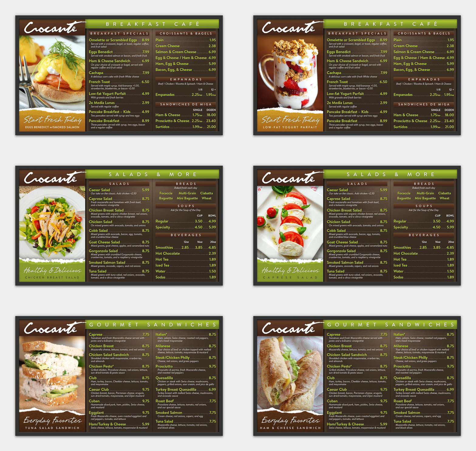
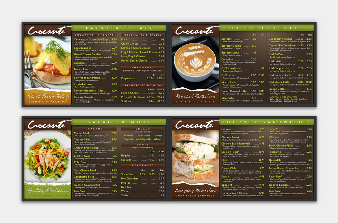
Manifest reorganized the menu for a more intuitive, at-a-glance experience. We also redesigned their four 48″ digital displays with bold, legible text, colorful photography, and multiple rotating features to help retail the full breadth of their menu.


